


NEW Feature
Visitor 1insights

Thank you for selecting OneSpace Central to empower your community. We at OneSpace are more than happy to assist you in case you have any troubles with your Site Management system.
This guide was made to provide a quick reference for common actions, functions, and workings within the 1insights pages of Central. If this guide fails in assisting you with understanding the 1insights functionality, please do not hesitate to email us on support@one-space.co.za.
This guide will address the following:
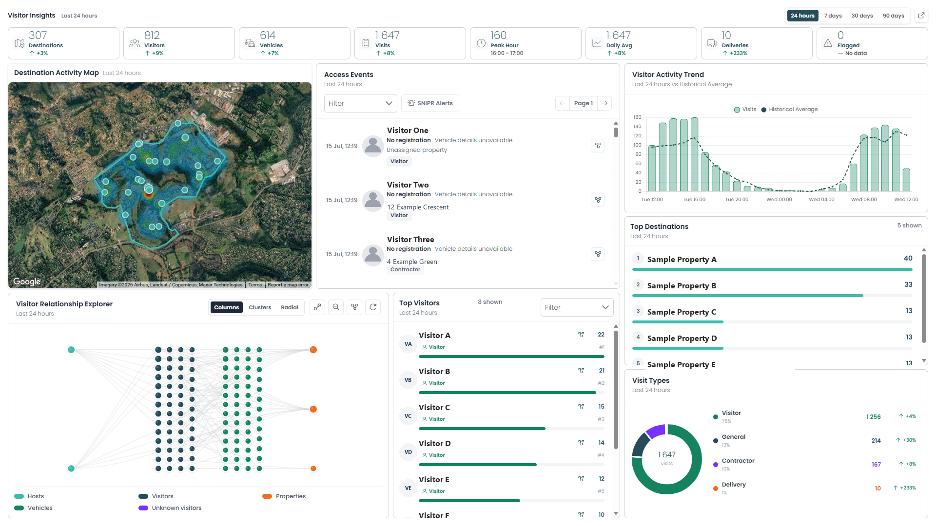
The Visitor 1insights page gives you a real-time overview of who's coming and going across your estate — where they're heading, how they're connected, and how current activity compares to the norm. It combines a live access event feed, an interactive map, trend charts, and a relationship explorer so you can spot patterns, verify visits, and investigate anything unusual, all from one screen. Use the time range filter at the top to view activity over the last 24 hours, 7 days, 30 days, or 90 days.
Time Range & Key Stats
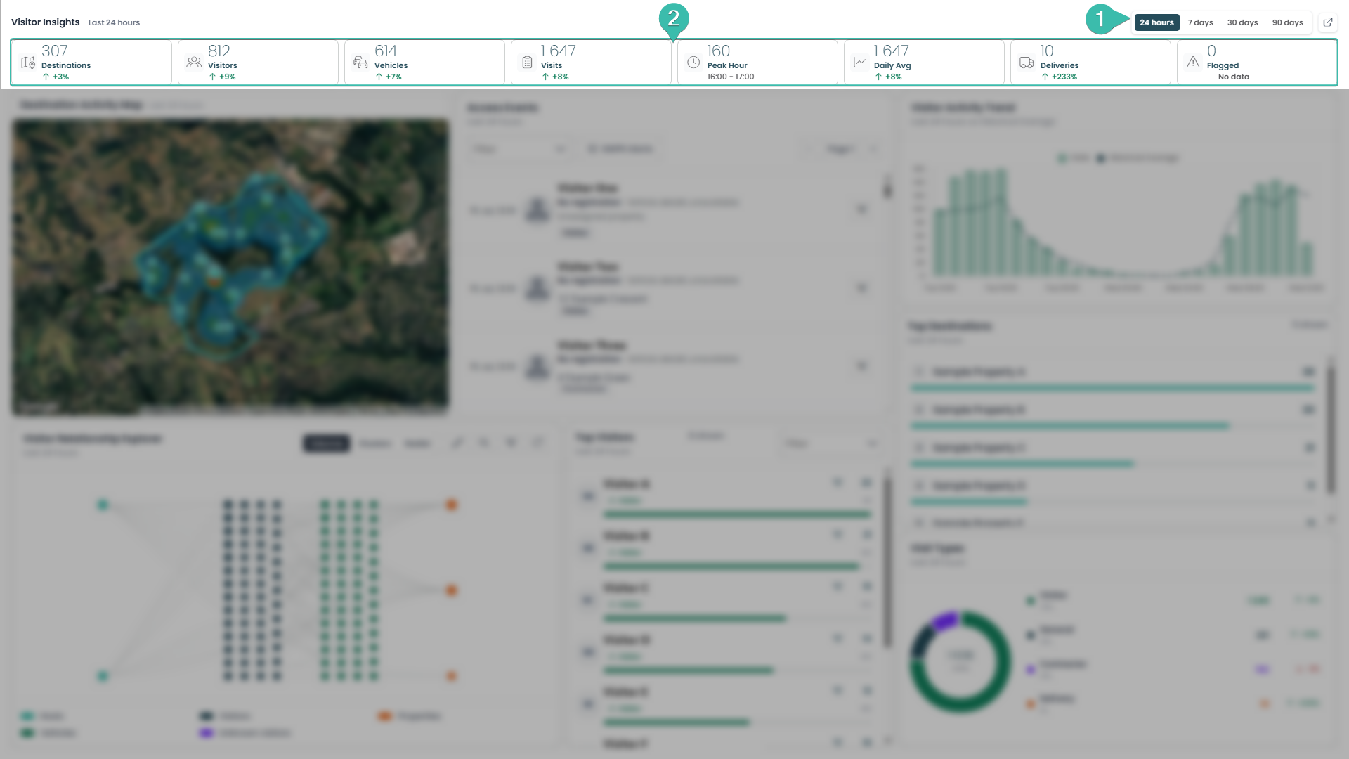
This bar sets the context for everything else on the page.
Time Range Filter — Choose the period you want to analyze: 24 hours, 7 days, 30 days, or 90 days. Every map, chart, and list on the page updates instantly to match your selection.
Key Stats — A quick-glance summary of estate activity for the selected period: Destinations, Visitors, Vehicles, Visits, Peak Hour, Daily Average, Deliveries, and Flagged Events. Each card (except Peak Hour and Flagged Events) shows a percentage change against the previous equivalent period — e.g. this week vs. last week — so you can tell at a glance whether traffic is trending up or down.
How to read it: A green ↑ means the number has grown since the last comparable period; a red ↓ means it's dropped. No arrow (like on Peak Hour) just means there's nothing to compare it to.
What to do with it: Start every review here before drilling into the sections below. If Flagged Events is ever above 0, treat it as a trigger to jump straight to the Access Events list and investigate. If Visits or Visitors shows an unusual spike, switch the time range to 7 or 30 days to see whether it's a one-off or the start of a trend before reacting.
Destination Activity Map
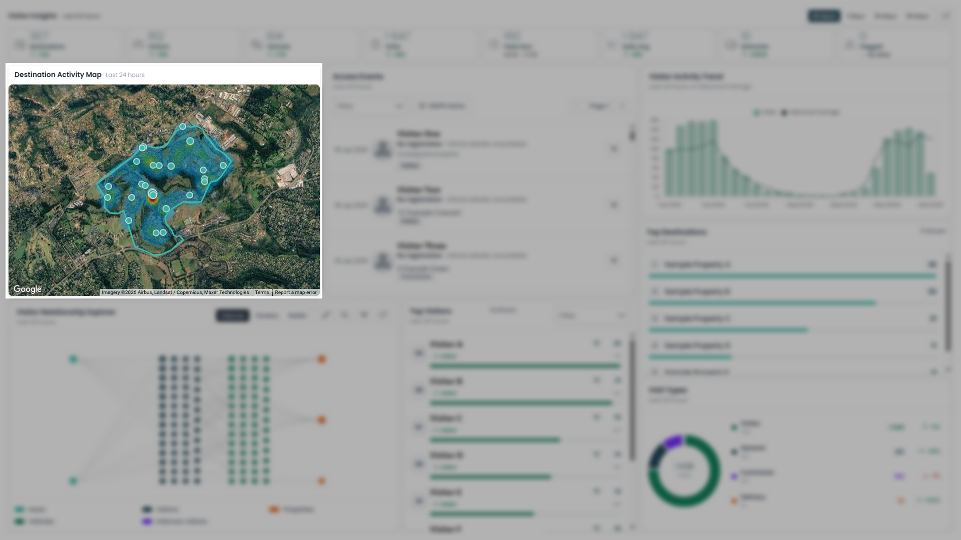
Destination Activity Map — A heatmap of where activity is happening across the estate, overlaid on the property boundary. Each pin marks a destination; the warm red/orange glow shows where visits are concentrated, while cooler/blue areas represent lighter, baseline traffic.
How to read it: The brighter and redder a cluster, the more access events are happening at that location right now, relative to the rest of the estate.
What to do with it: Glance at this first to spot anything unusual — a hotspot at a property that's normally quiet can mean an event, a gathering, or something worth a closer look. Cross-reference the address against Access Events or Top Destinations to see exactly who's driving that spike.
Access Events
A live, feed of every access event recorded in the selected time range, newest first. Each entry shows the time, visitor's name and photo, vehicle registration and description (or "unavailable" if not captured), destination, and visit type (Visitor, General, Contractor, Delivery).
Drill-down icon — Click this icon on any entry to load that specific visitor into the Visitor Relationship Explorer panel below, instantly showing their connections: which property they visited, which vehicle they arrived in, and who hosted them.
How to read it: Use the Filter dropdown to narrow the feed to a specific visit type, or click SNIPR Alerts to show only vehicles matched against the SNIPR flagged/wanted-vehicle list.
What to do with it: Don't stop at reading the row — if a name looks unfamiliar, arrived with no registration, or just seems worth a second look, click the drill-down icon to pull up their full relationship map below rather than searching for them separately. If SNIPR Alerts ever returns a result, drill into it immediately and verify with security before doing anything else.
Relationship Explorer - The Power of Drilling Down
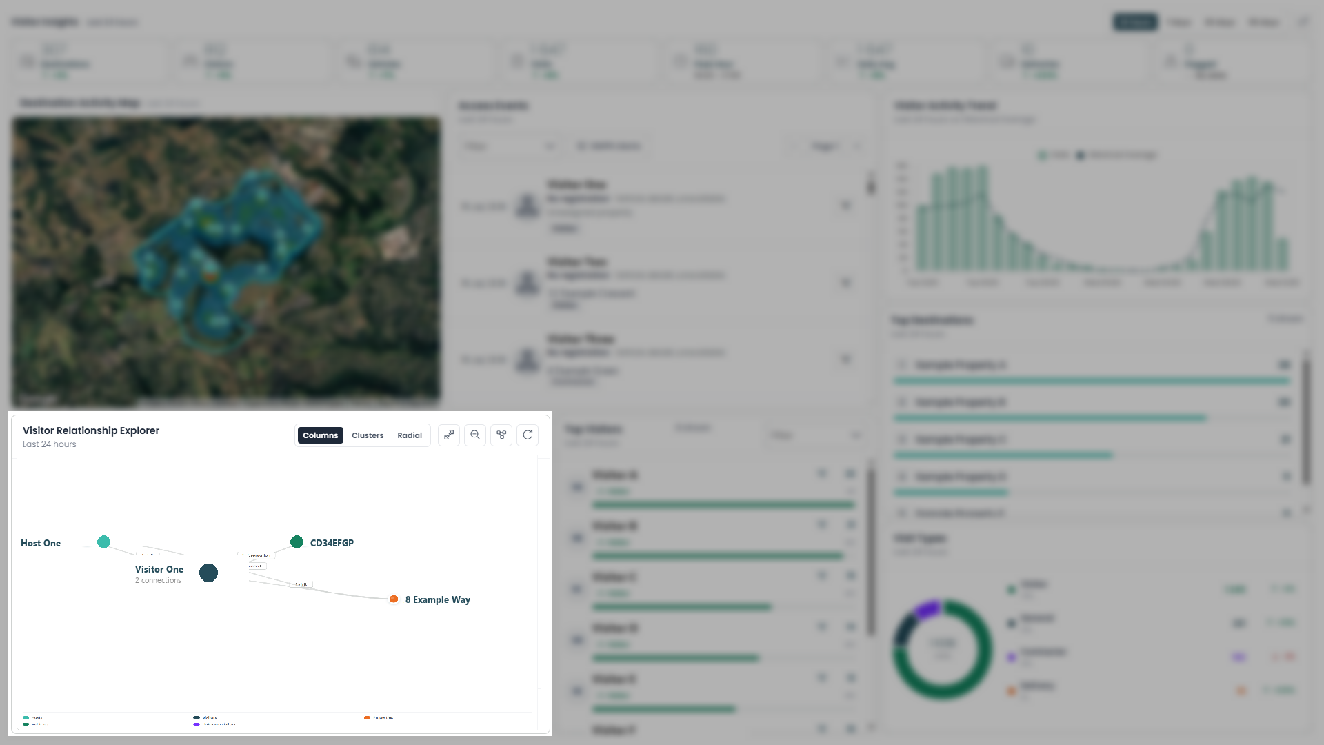
This is what you get when you click the drill-down icon on an Access Event: the Visitor Relationship Explorer instantly re-centers on that one visit and lays out everything connected to it — the host who invited them, the vehicle they arrived in, and the property they visited — all in one glance.
How to read it: Each line is a real, recorded connection, not a guess. The label on each line tells you what kind of connection it is and how often it's happened — "1 visit," "1 observation," or, notably, "flagged entry" when something about that link was marked for attention.
Why this matters: A single Access Event row only tells you what happened. This view tells you how it fits together. Instead of manually cross-referencing a visitor against a host, a vehicle, and a property history, one click gives you the whole picture — instantly surfacing things a flat list never would, like a visitor connected to a flagged entry, or a vehicle linked to more than one visitor.
What to do with it: Whenever something in Access Events looks slightly off, don't stop at that one row — drill in. If a connection is labeled "flagged," treat it as your starting point for investigation, not a footnote: follow it back to the host and the property to understand the full context before deciding what to do next.
Top Visitors
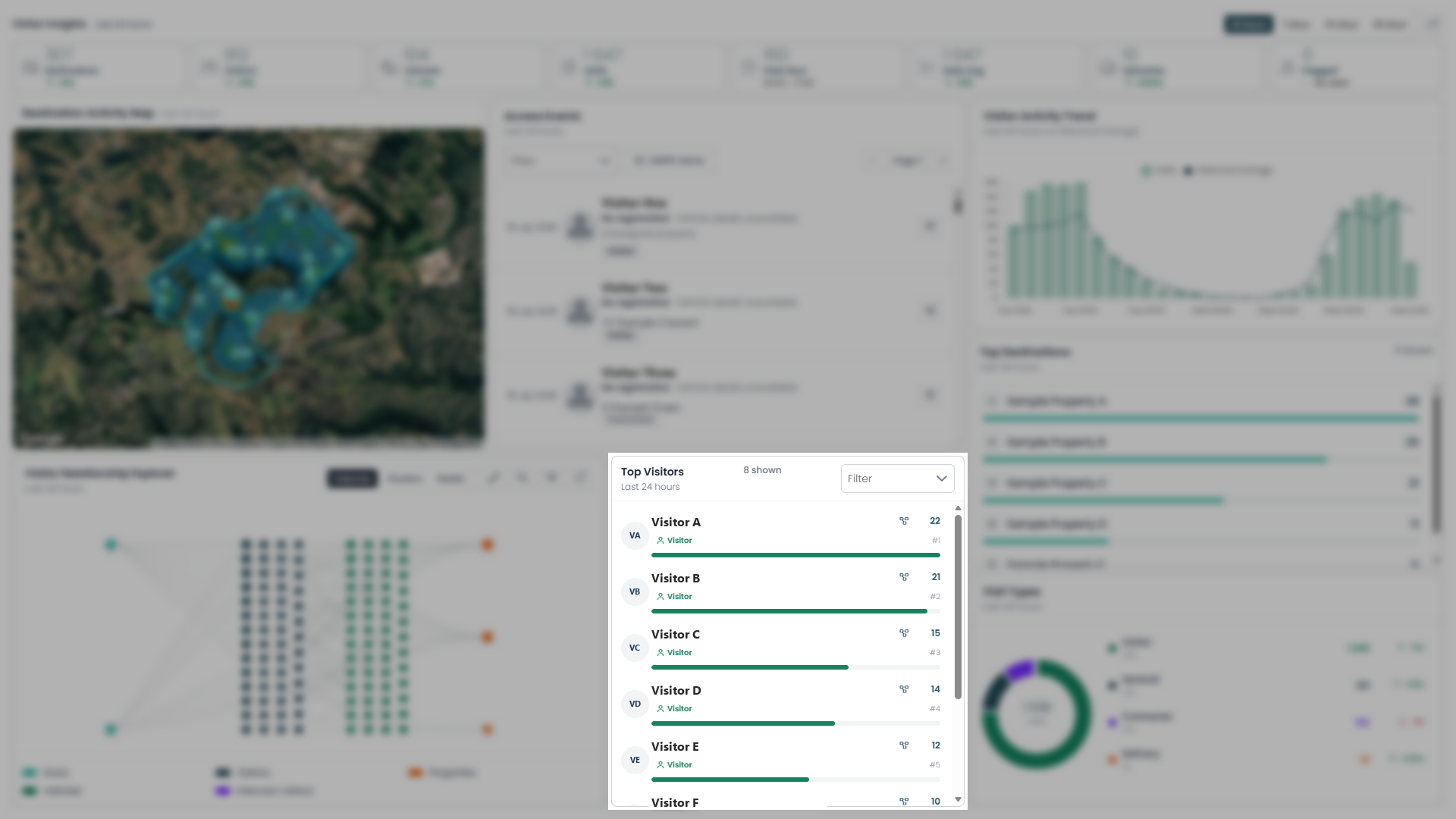
A ranked list of the most frequent visitors in the selected time range, ordered by visit count.
How to read it: Each row shows the visitor's name, visit type, and total visits, with their rank (#1, #2...) shown alongside. Use the Filter dropdown to narrow the list to a specific visit type.
Note — this section also drills down: Click the icon next to any visitor's count to load them into the Visitor Relationship Explorer below, just like in Access Events. Since this list is ranked by frequency, drilling down here is especially useful for a different reason: it shows you exactly who is inviting your top visitors. A regular visitor should trace back to a consistent host — if their connections span multiple hosts, or a host with no clear link to them, that's a pattern worth understanding.
What to do with it: Use this list as your regulars check — domestic staff, contractors, and frequent guests should make up most of it, with visit counts that look consistent with expectations. For anyone unfamiliar near the top, or whose count has jumped compared to previous periods, don't just note it — drill in and confirm who's hosting them before moving on.
Visitor Activity Trend
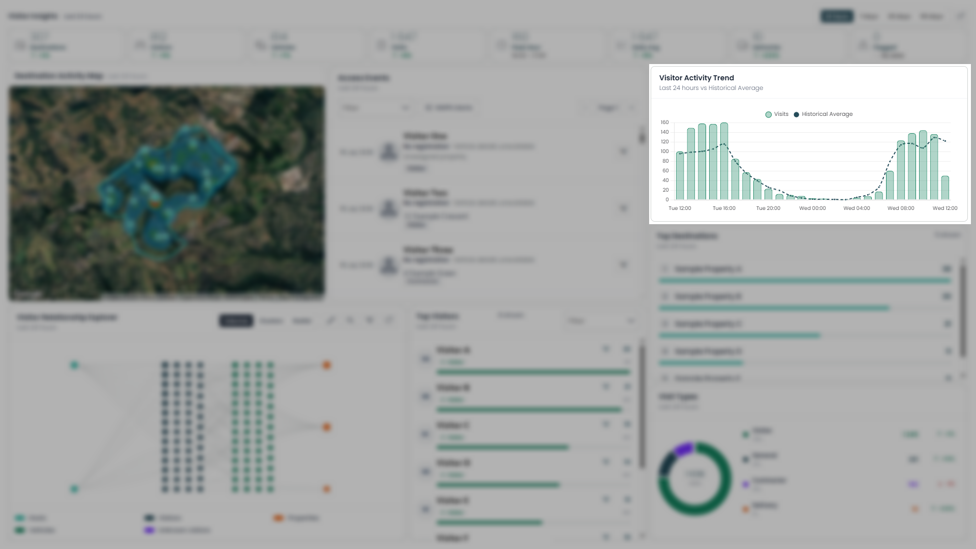
A combo chart plotting visit volume over time (bars) against the typical pattern for that period (dotted line), so you can see not just how busy it's been, but whether that's normal.
How to read it: Each bar is the number of visits in that time slot; the dotted Historical Average line is what's typically expected at that same time. Bars rising above the line mean busier than usual; bars sitting below mean quieter than usual. The overall shape also shows your estate's natural rhythm — you'll typically see it dip overnight and rise again during the day.
What to do with it: Use the shape of this chart to plan staffing and patrols around real peak times rather than guesswork — it's the detailed, hour-by-hour version of the "Peak Hour" stat card up top. More importantly, watch for bars that break from the dotted line: a spike at an hour that's normally quiet (like the middle of the night) is exactly the kind of anomaly worth cross-checking against Access Events for that specific window.
Top Destinations
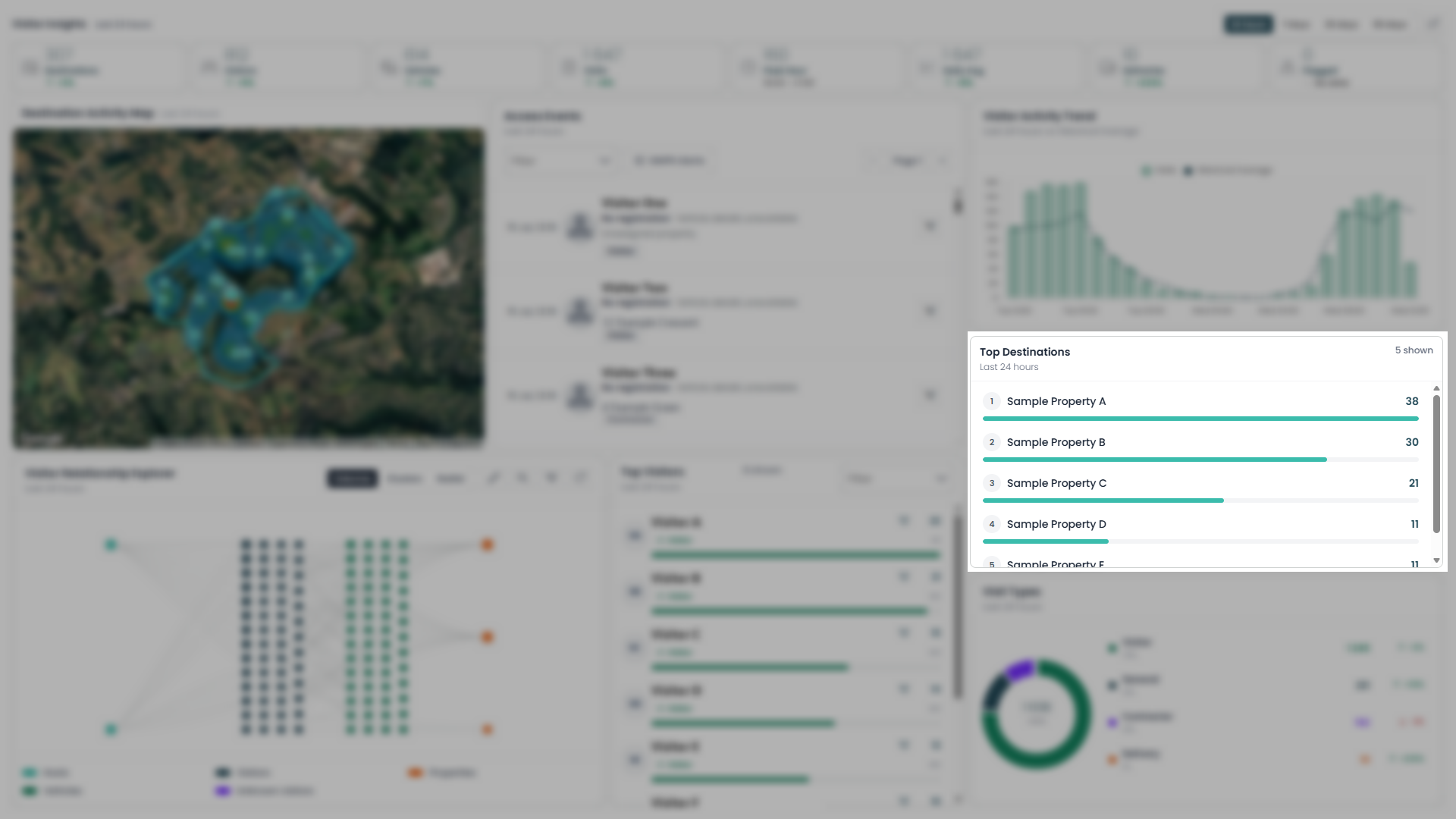
A ranked list of the most-visited properties in the selected time range, ordered by visit count, with a bar showing each one's share relative to the top result.
How to read it: Rank #1 is the property that received the most visits in the period; the bar length gives you a quick visual sense of how much busier it is than the ones below it.
What to do with it: Use this to sanity-check that traffic is landing where you'd expect — if a property near the top isn't usually a high-traffic destination, cross-reference it against the Destination Activity Map and Access Events for that address to understand why. It's also a useful list to revisit over longer ranges (7/30/90 days) to spot properties that consistently draw the most visitors, which can inform where to focus security attention or amenity planning.
Visit Types
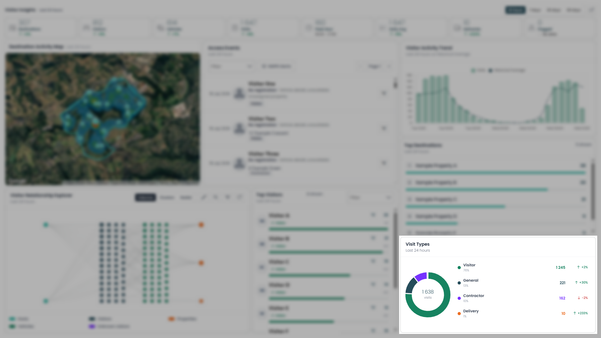
A breakdown of every visit in the selected time range by category — Visitor, General, Contractor, and Delivery — shown as a donut chart with the total in the center.
How to read it: Each segment's size reflects its share of total visits; the list beside it gives the exact count and percentage change versus the previous equivalent period for each category.
What to do with it: Use this to understand the composition of your traffic, not just the volume. If Contractor or Delivery visits jump sharply compared to normal, it's worth confirming that matches expected work orders or scheduled deliveries rather than assuming it's routine. Since this breaks down the same total shown in the Key Stats bar up top, it's the natural next step whenever that total looks unusual — this tells you which visit type is actually driving the change.
Visitor MultiSights
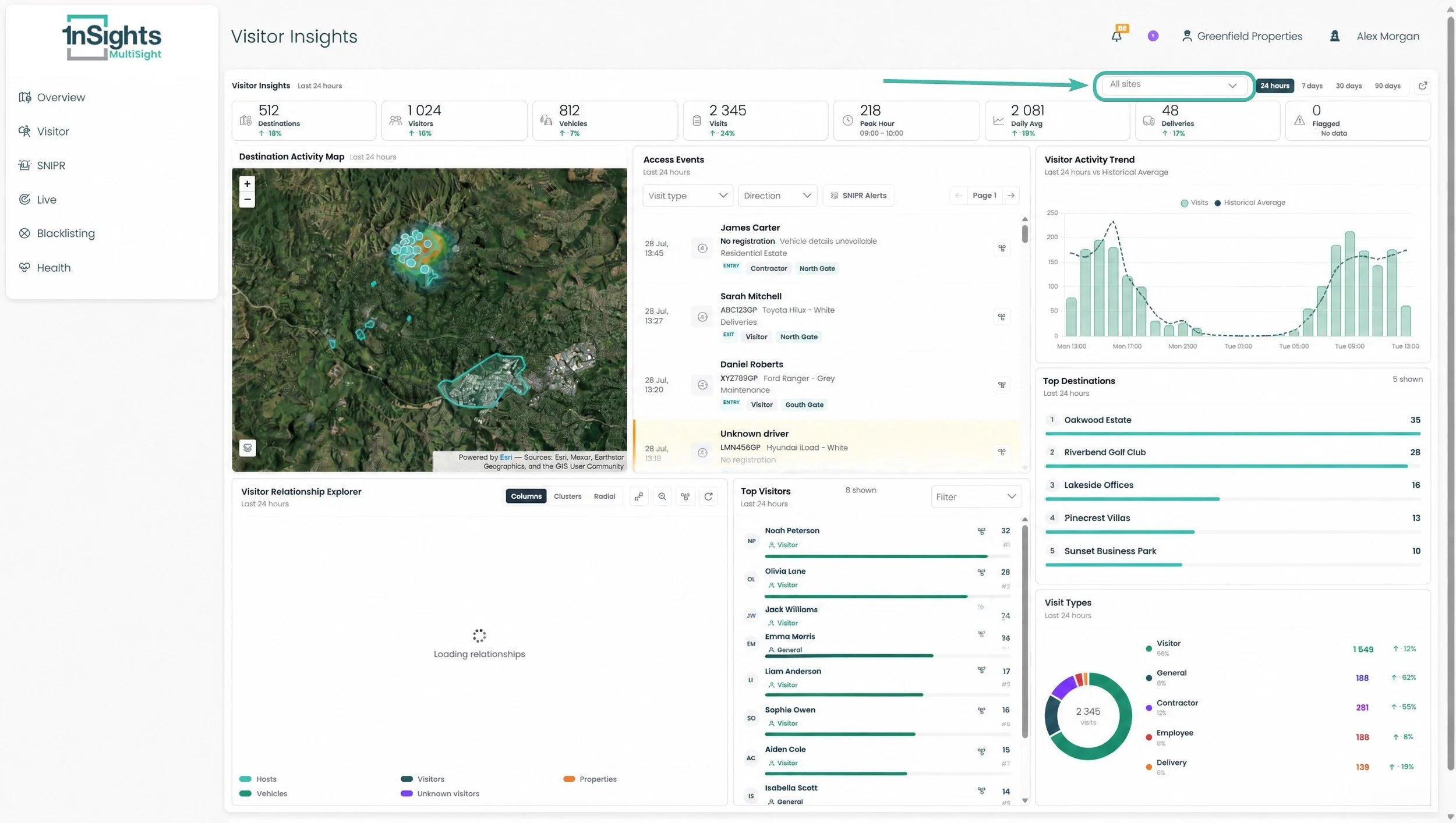
The Multi-Sight Visitor 1insights Overview is the multi-site version of Visitor 1insights. Instead of one estate, it aggregates activity across every site you manage into a single dashboard — so you can review your whole portfolio at a glance, then narrow down to specific sites when something needs attention.
1insights Overview — Site Selection
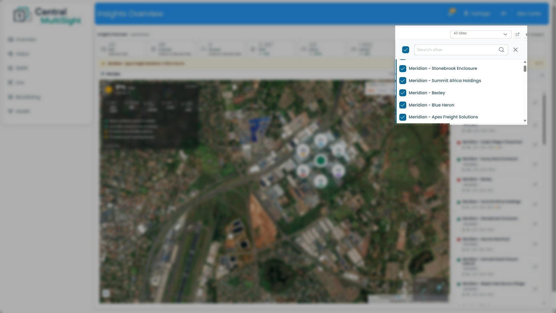
This is the control that decides which of your sites the entire dashboard reports on. Everything else — the Key Stats, the map, and the per-site list — reflects whatever you select here.
Site selector ("All sites") — The dropdown at the top right of the dashboard. Click it to open the site list shown here. The label reflects your current selection: All sites when everything is included, or a count/site name when you've narrowed it down.
Select-all checkbox — The ticked box at the top left of the panel. Use it to select or clear every site at once, rather than ticking them individually.
Search sites — Type here to filter the list by name — useful when you manage a long list of sites and want to jump straight to one.
Site checklist — Each site in your portfolio with a checkbox. Tick the sites you want included and untick the ones you don't; the dashboard updates to match. (In this view all sites are ticked, matching the "All sites" state.)
Close (X) — Closes the selector and returns you to the dashboard with your selection applied.
How to read it: A ticked box means that site's data is included in everything on the dashboard. "All sites" in the selector label confirms your whole portfolio is in view.
What to do with it: Start with All sites for a portfolio-wide view, then narrow down when you need to focus — for example, tick only the sites in one region, or a single site you're investigating, so the stats and map show just that group. Use Search sites to find a specific site quickly instead of scrolling.
1insights Overview — Site Metrics
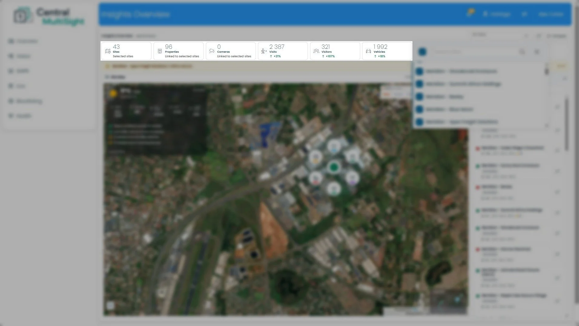
This row sits directly below the header and summarises activity across every site you currently have selected. It's the multi-site equivalent of the single-site Key Stats bar — the difference is that these totals roll up all selected sites into one figure, rather than reporting on a single estate. Change your selection in the site selector (Section 2) and these numbers update to match.
How to read it: The first three cards (Sites, Properties, Cameras) describe the scope of what you're looking at — how many sites, properties, and cameras are included. The last three (Visits, Visitors, Vehicles) describe the activity within that scope for the selected time range. A green ↑ means the figure has grown since the last comparable period; a red ↓ means it's dropped.
What to do with it: Read this row first, before the map or the site list. Check the Sites count matches the selection you intended — if it's lower than expected, you may have sites unticked in the selector. Then use Visits, Visitors, and Vehicles as your portfolio pulse: a large swing in any of them (like Visitors at +107% here) is worth drilling into, either by narrowing the site selection or opening the individual site from the list on the right to see which site is driving the change.
1insights Overview — Compare
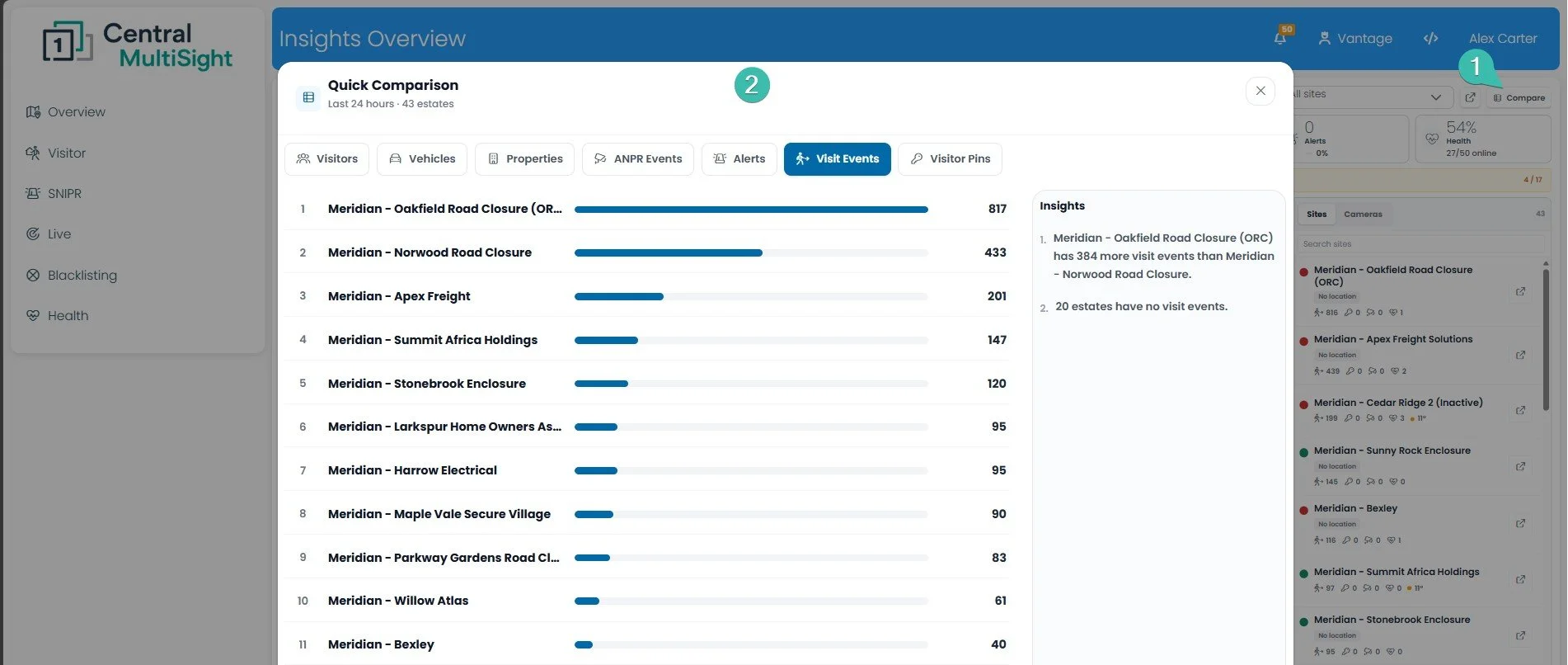
How to read it: Rank #1 is the site leading on whichever tab you've selected; the bar lengths let you gauge at a glance how much busier the top sites are than the rest. Switch tabs to re-rank the same sites by a different metric.
What to do with it: Use this to spot outliers across your portfolio fast. Switch to the Alerts or ANPR Events tab to see which sites are generating the most events needing attention, then open that site from the list to investigate. It's also useful the other way around — sites sitting at the bottom of Visit Events or with no activity at all can be worth a check to confirm that's expected and not a sign a site has gone quiet unexpectedly.