


NEW Feature
Live 1insights

Thank you for selecting OneSpace Central to empower your community. We at OneSpace are more than happy to assist you in case you have any troubles with your Site Management system.
This guide was made to provide a quick reference for common actions, functions, and workings within the 1insights pages of Central. If this guide fails in assisting you with understanding the 1insights functionality, please do not hesitate to email us on support@one-space.co.za.
This guide will address the following:
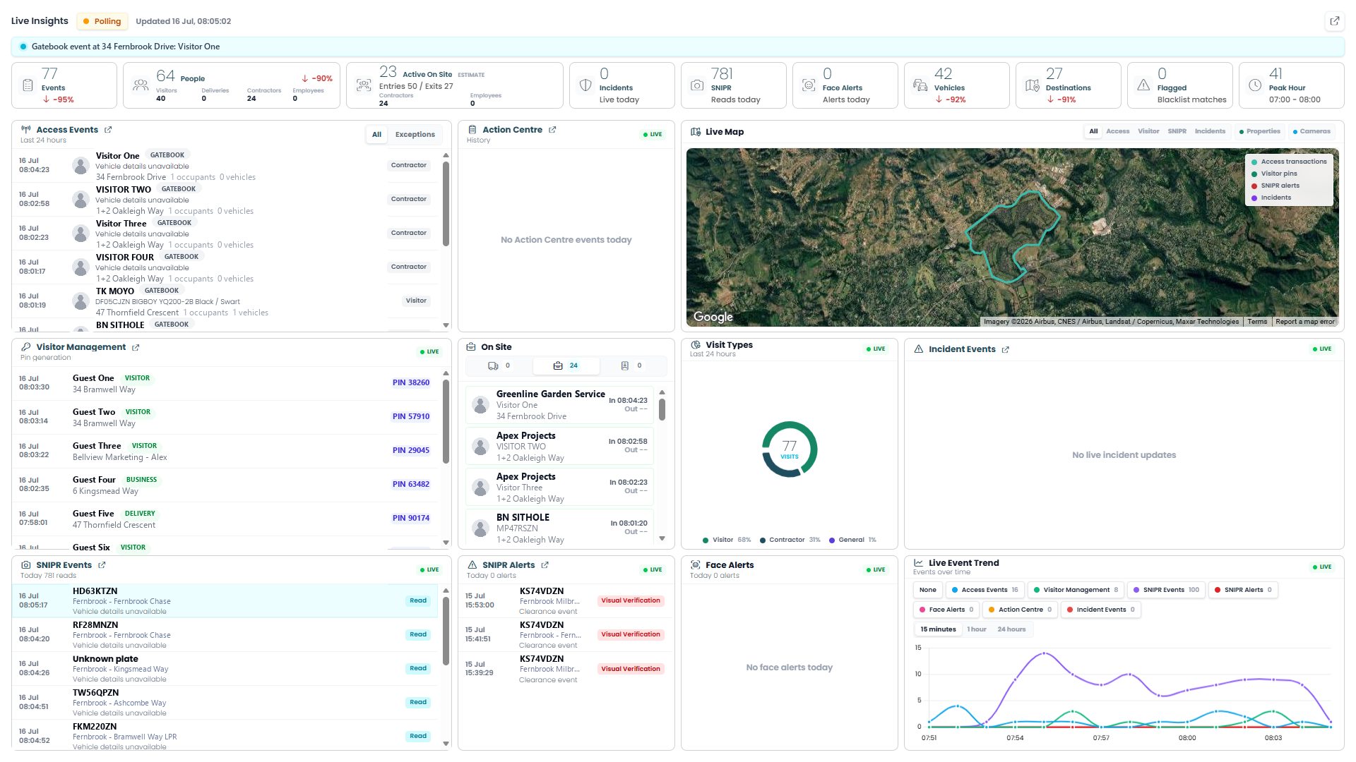
Live 1insights is a real-time operations dashboard, a single screen that brings together everything happening on the estate right now: who's passing through access points, who's registered as an on-site visitor, and what your SNIPR cameras are reading and flagging. Instead of checking access control, visitor management, and SNIPR separately, this page pulls all three into one live view.
The page polls continuously for new activity, so it's always current, each panel updates on its own as new events happen, with the most recent Gatebook event appearing at the top. Unlike the other 1insights pages, there's no date range to select and no way to drill into a specific record for more detail; Live 1insights is built purely for keeping an eye on what's happening at this moment, not for reviewing history or investigating a past event.
Its usefulness is mainly for anyone who needs situational awareness — security staff, control room operators, estate managers — who want one glance to answer "what's happening on the estate right now?" without switching between systems.
Live Status Bar & Summary Cards
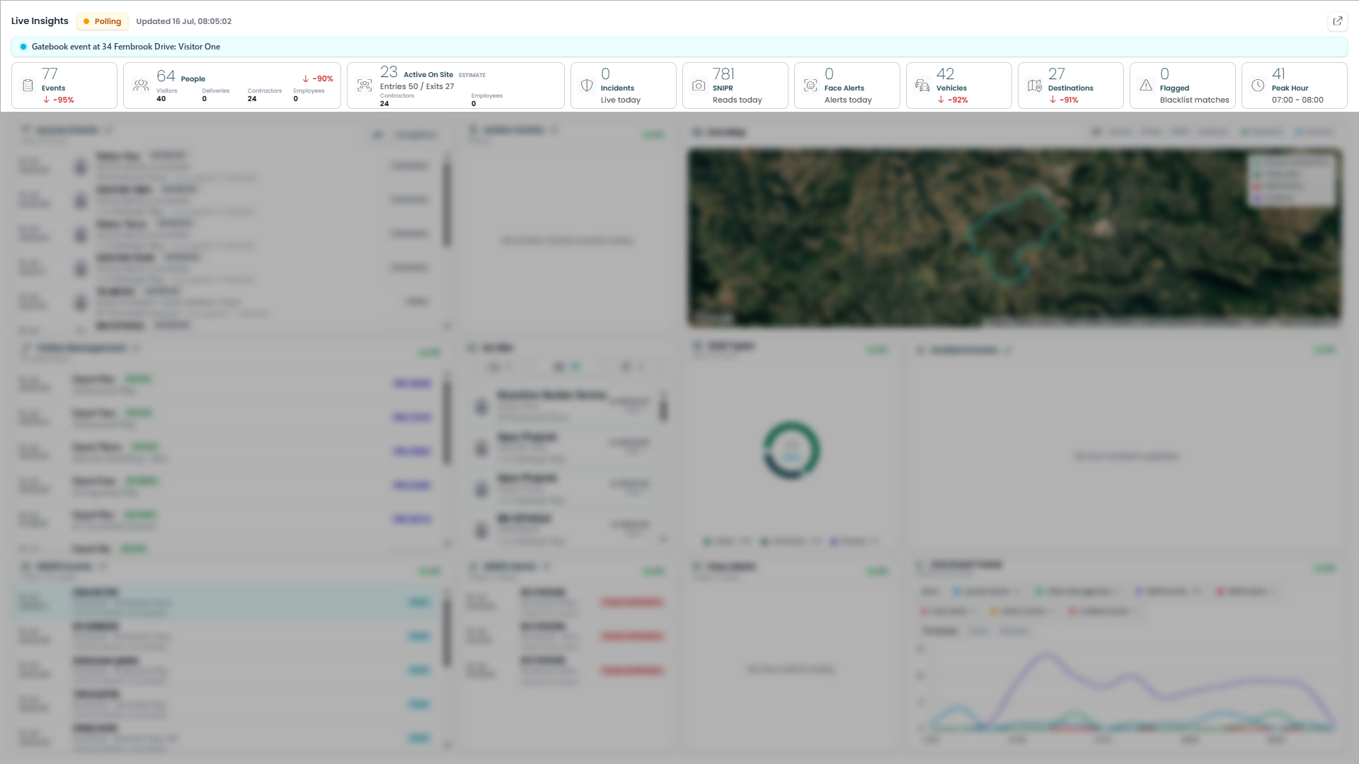
A live status bar (Polling indicator, last-updated time, and the latest Gatebook event) sits above ten summary cards: Events, People, Active On Site, Incidents, SNIPR, Face Alerts, Vehicles, Destinations, Flagged, and Peak Hour.
How to read it: Same-day totals that refresh with the page. Percentage arrows compare against a typical day, not yesterday.
What to do with it: Use it as a quick health check — anything unusual here (spikes in Incidents, Flagged, Face Alerts) is your cue to check the matching panel below.
Access Events
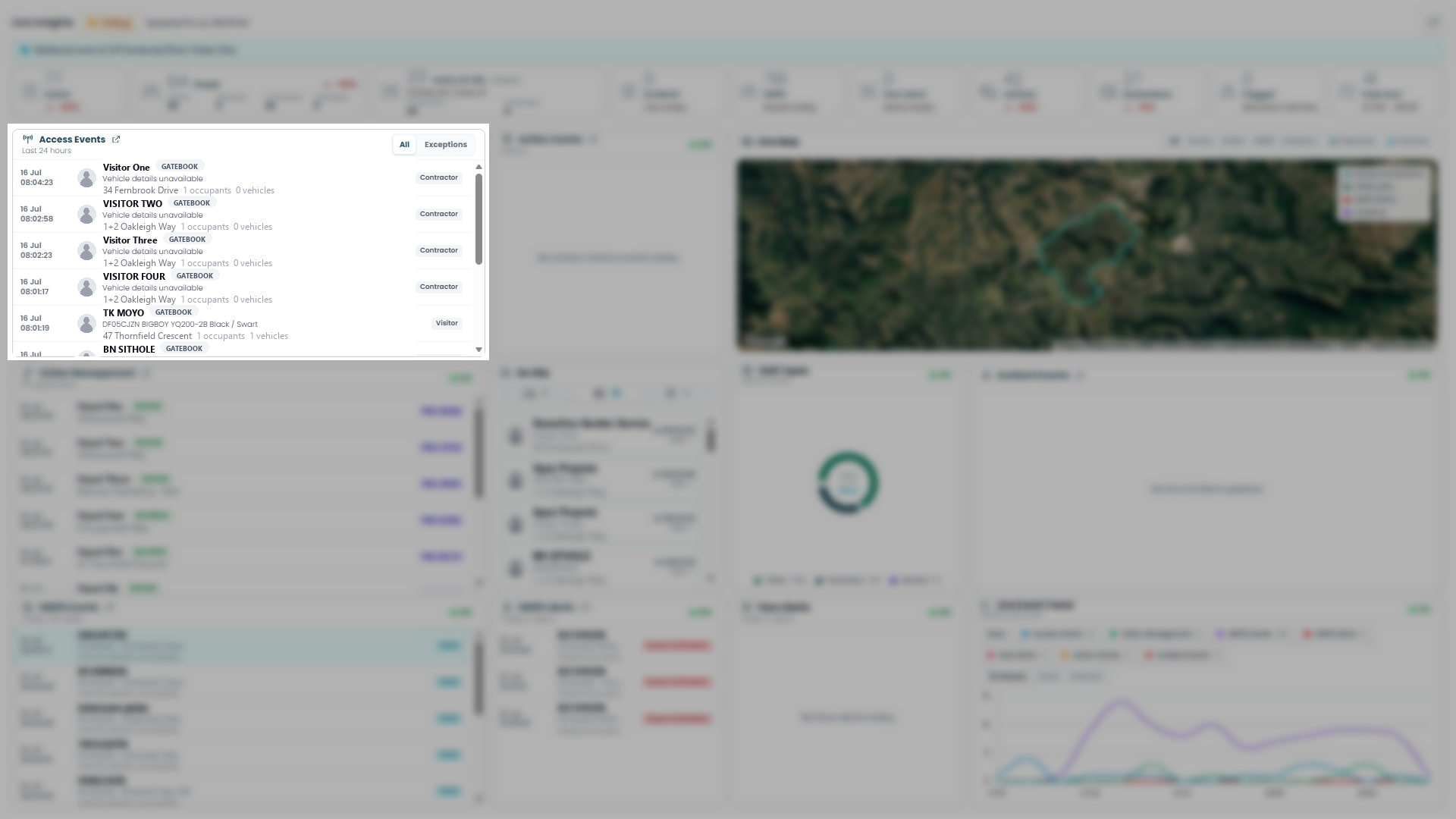
A live feed of Gatebook access events from the last 24 hours — name, time, vehicle details, destination, and visitor type (Contractor/Visitor/etc.) — filterable to All or Exceptions.
How to read it: Newest event at the top, updating continuously as people pass through access points.
What to do with it: Scan it to see who's currently moving through access control; use Exceptions to spot events flagged as unusual.
Action Centre
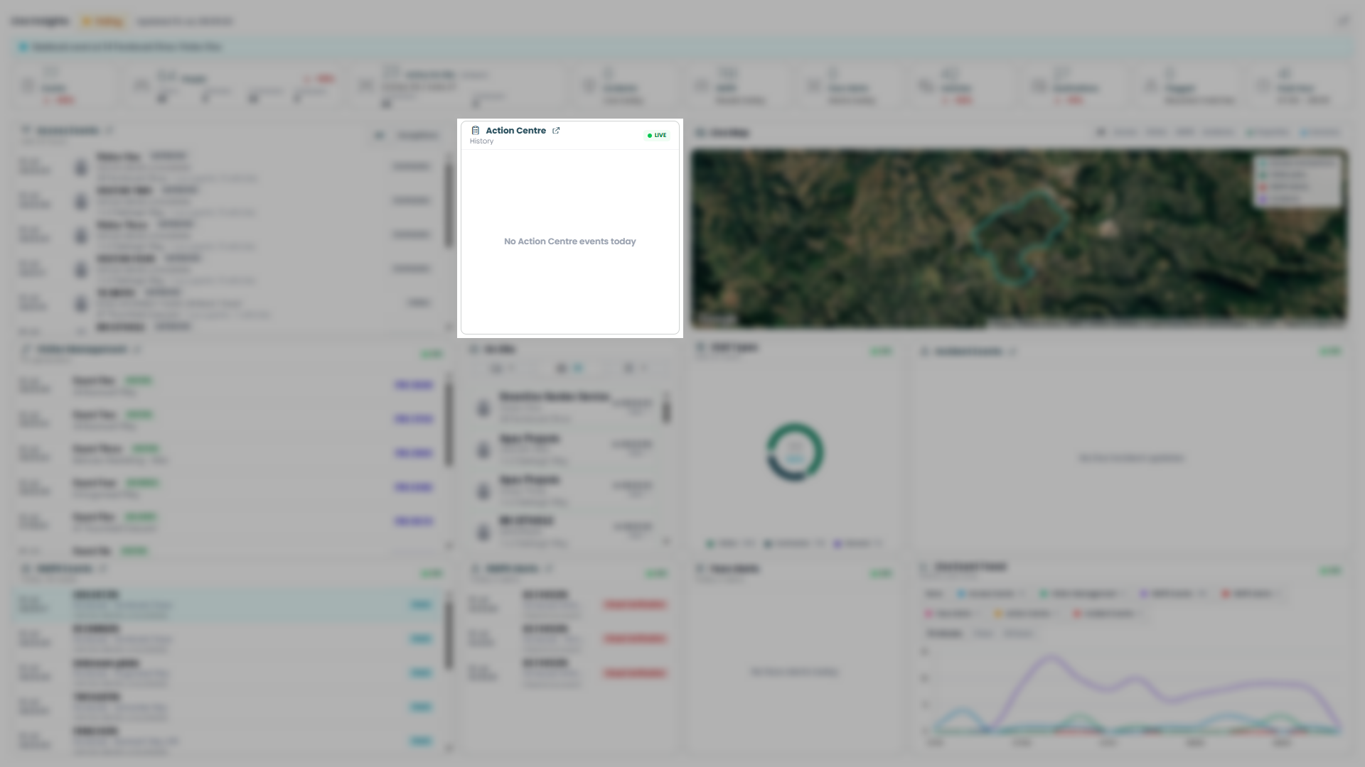
A live feed of items needing attention — things like new resident approvals or resident requests related to access control. Empty here, showing "No Action Centre events today."
How to read it: Each entry is a pending item raised by a resident or the system, not just an activity log.
What to do with it: Check here for outstanding approvals or requests that need action from you — an empty list means nothing's currently waiting.
Live Map
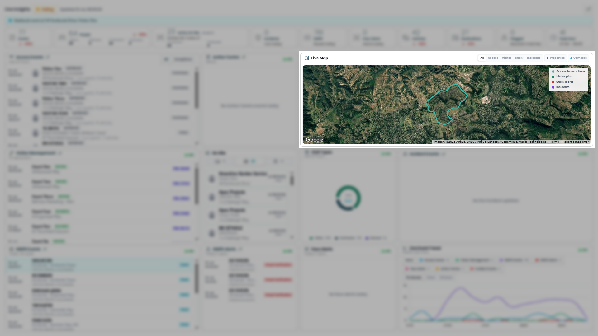
A satellite view of the estate boundary showing live activity as map pins — access transactions, visitor pins, SNIPR alerts, and incidents — filterable by type (All/Access/Visitor/SNIPR/Incidents), with toggles for Properties and Cameras overlays.
How to read it: Pins appear in real time at the location where each event happened; colour indicates the event type per the legend.
What to do with it: Use the filters to focus on one activity type and spot where on the estate things are happening — useful for spatial context the list panels don't give you.
Visitor Management
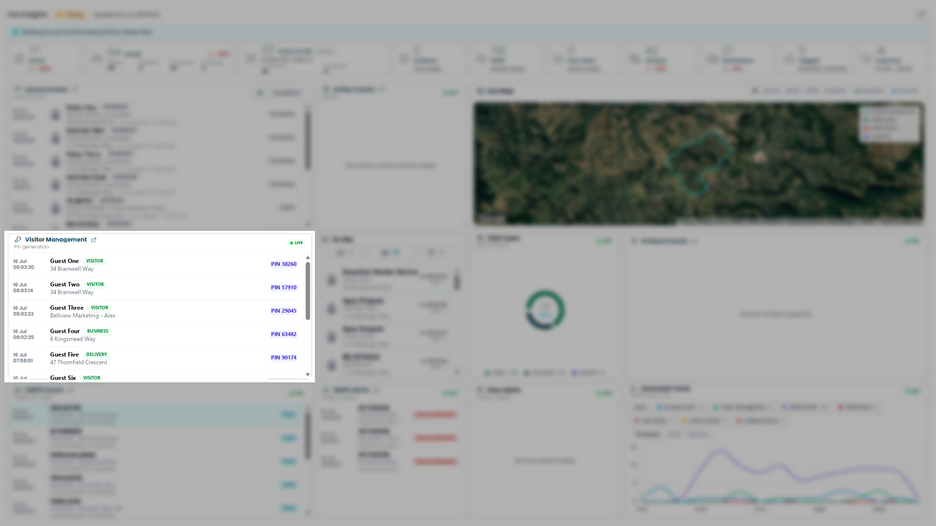
A live feed of PIN generation for visitors, businesses, and deliveries — name, type badge, address or business reference, and the generated PIN.
How to read it: Newest PIN request at the top, updating as visitors are registered.
What to do with it: Use it to confirm a PIN was issued for a specific visitor, or to spot the type of access being generated (Visitor/Business/Delivery) in real time.
On Site
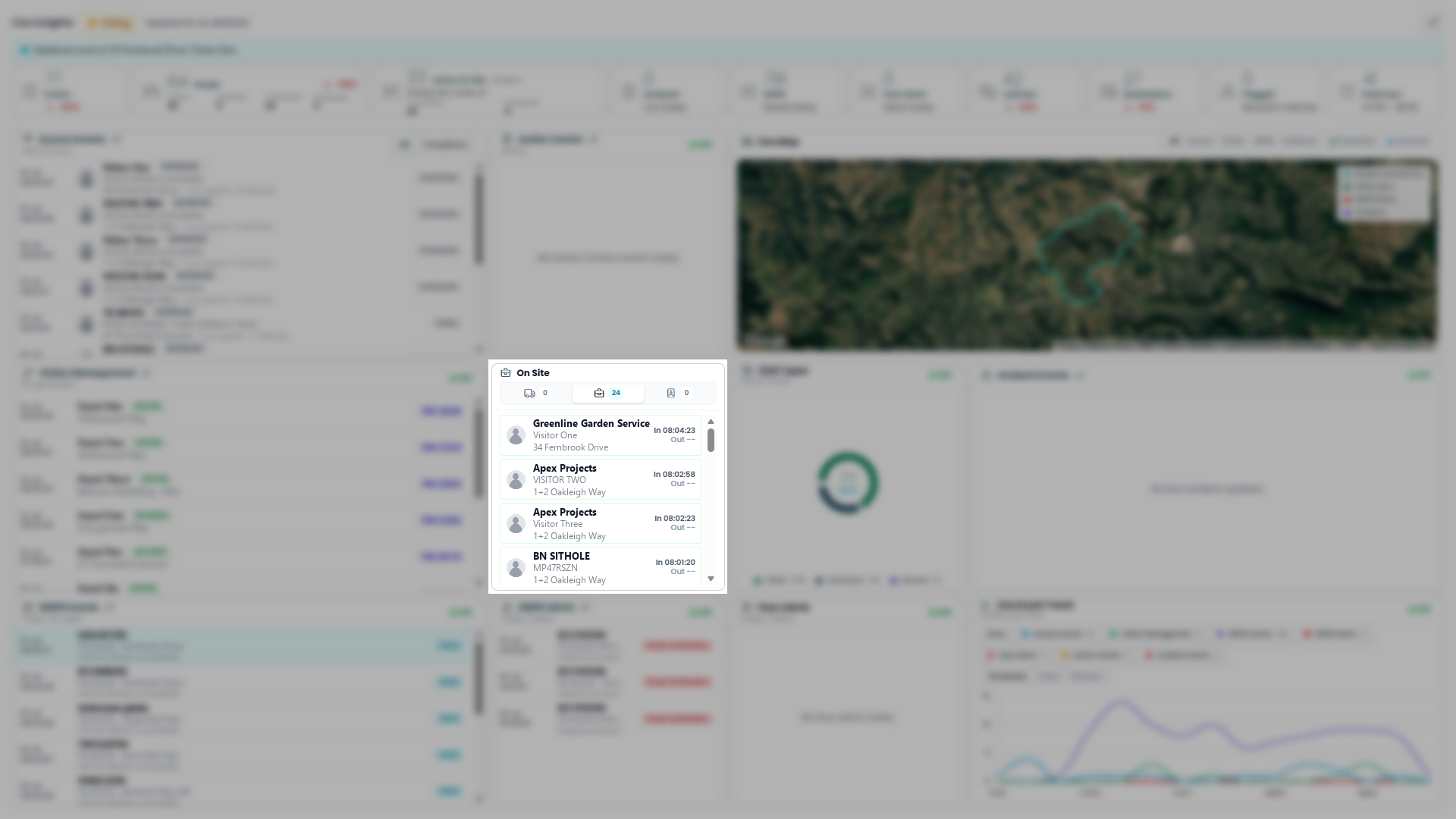
A live list of who's currently on the estate, tabbed by type (deliveries / contractors / visitors, with a count each), showing name, address, and In/Out times.
How to read it: "Out --" means the person hasn't signed/checked out yet — they're still on site.
What to do with it: Use it to check who's currently present, especially anyone whose "Out" time is missing well after you'd expect them to have left.
Visit Types
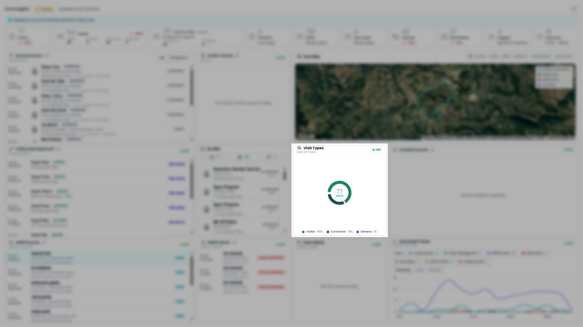
A donut chart breaking down today's visits by type — Visitor, Contractor, General — with a total visit count in the centre.
How to read it: Each segment's percentage reflects its share of today's total visits, updating live as new visits are logged.
What to do with it: Use it to gauge the mix of traffic on the estate at a glance — e.g. an unusual spike in one category could prompt a closer look at the panels above.
Incident Events
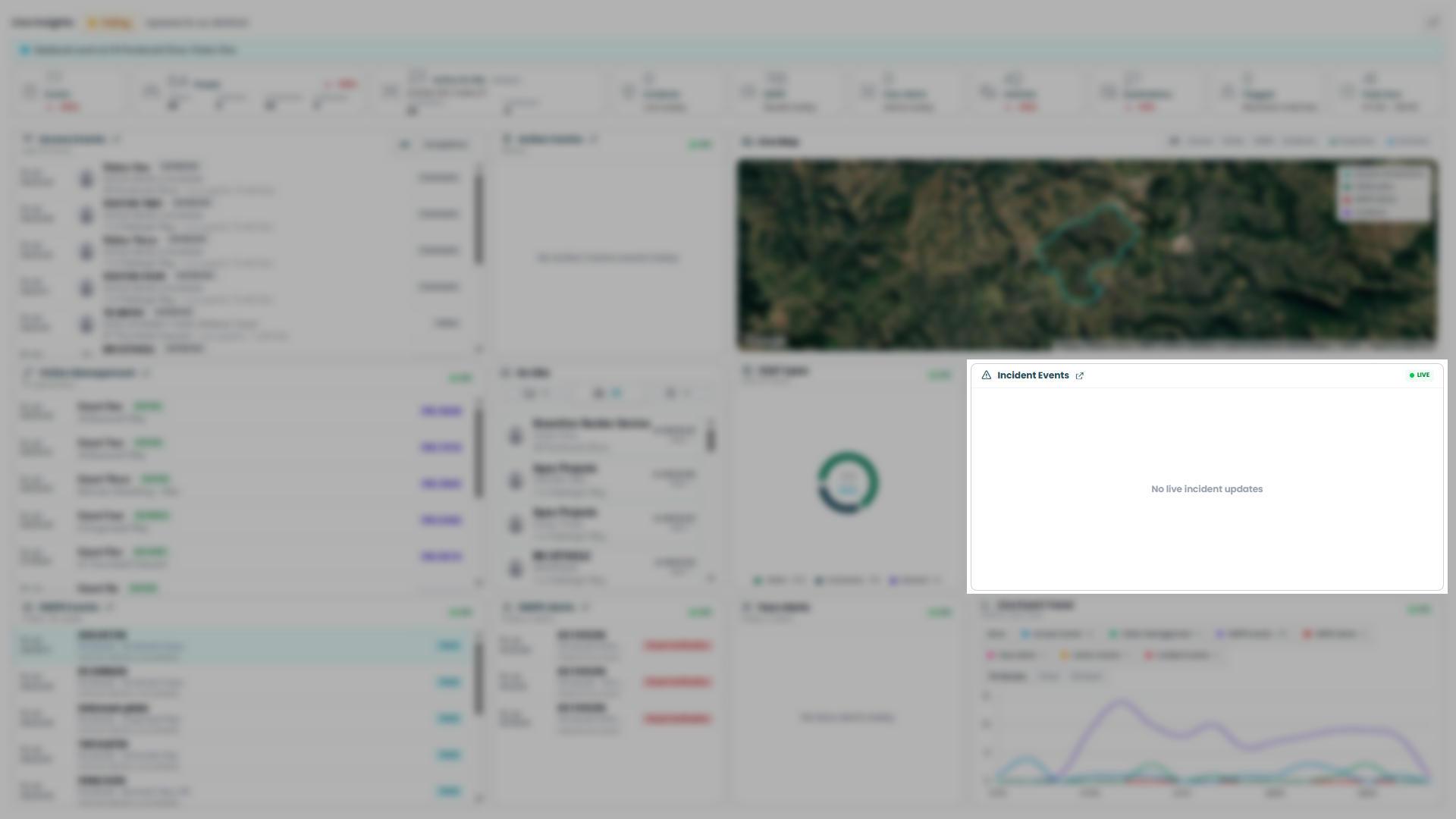
A live feed of reported incidents on the estate — currently empty, showing "No live incident updates."
How to read it: Populates as incidents are logged; empty means none have occurred today.
What to do with it: Keep an eye on this alongside the Incidents summary card — any entry here warrants immediate attention.
SNIPR Events
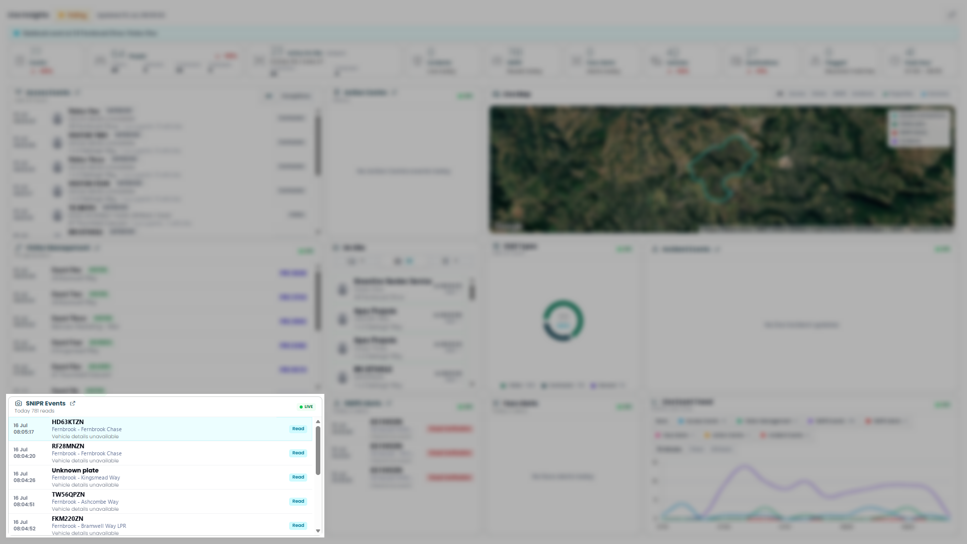
A live feed of every plate read by SNIPR cameras today — plate number, camera location, and a "Read" status.
How to read it: Newest read at the top; "Unknown plate" means the camera captured an event but couldn't resolve a plate.
What to do with it: Use it to see every vehicle movement being picked up by the camera network in real time, and which camera/location it came through.
SNIPR Alerts & Face Alerts
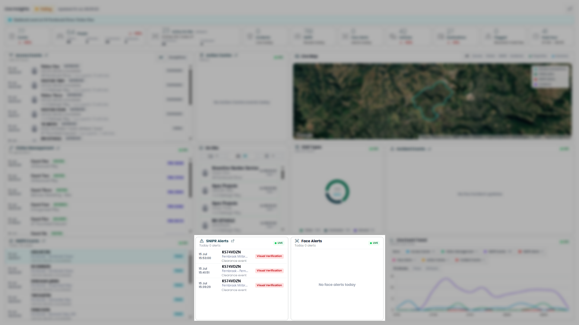
SNIPR Alerts: A live feed of flagged plate events (e.g. clearance events needing visual verification) — plate, camera location, event type, and a verification status badge.
How to read it: Each entry is a plate read that triggered a rule, not just a routine read; "Visual Verification" flags one needing a manual check.
What to do with it: Treat this as your action list for plate-related exceptions — anything appearing here needs review, unlike the routine SNIPR Events feed.
Face Alerts: A live feed of facial-recognition alerts — empty here, showing "No face alerts today."
How to read it: Populates only when a facial-recognition match/alert fires.
What to do with it: An empty list is good news; any entry warrants immediate attention.
Live Event Trend
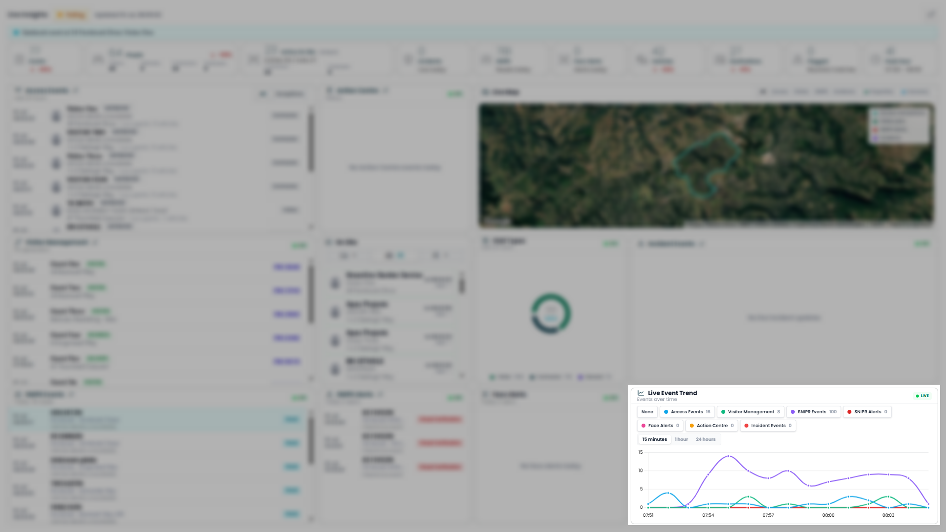
A multi-line chart plotting event volume over time, broken down by category — Access Events, Visitor Management, SNIPR Events, SNIPR Alerts, Face Alerts, Action Centre, Incident Events — toggleable via the legend, with 15 minutes/1 hour/24 hours time-window options.
How to read it: Each line tracks one category's event count over the selected window; toggle categories on/off via the legend buttons to reduce clutter.
What to do with it: Use it to spot spikes or patterns over time across categories — e.g. a SNIPR Events surge coinciding with an Access Events dip — rather than relying on the single live-feed panels alone.
Live MultiSight 1insights
Everything above describes Live 1insights for a single Site. Central Multi-Sight gives you the same page for your whole portfolio at once.
Rather than watching each site on its own screen, the Multi-Sight version brings live activity from all the sites you manage into one view. Every panel you already know — the Live Status Bar & Summary Cards, Access Events, Action Centre, Live Map, Visitor Management, On Site, Visit Types, Incident Events, SNIPR Events, SNIPR Alerts & Face Alerts, and the Live Event Trend — works exactly as described above. The only difference is that each one now reflects activity across multiple sites instead of one.
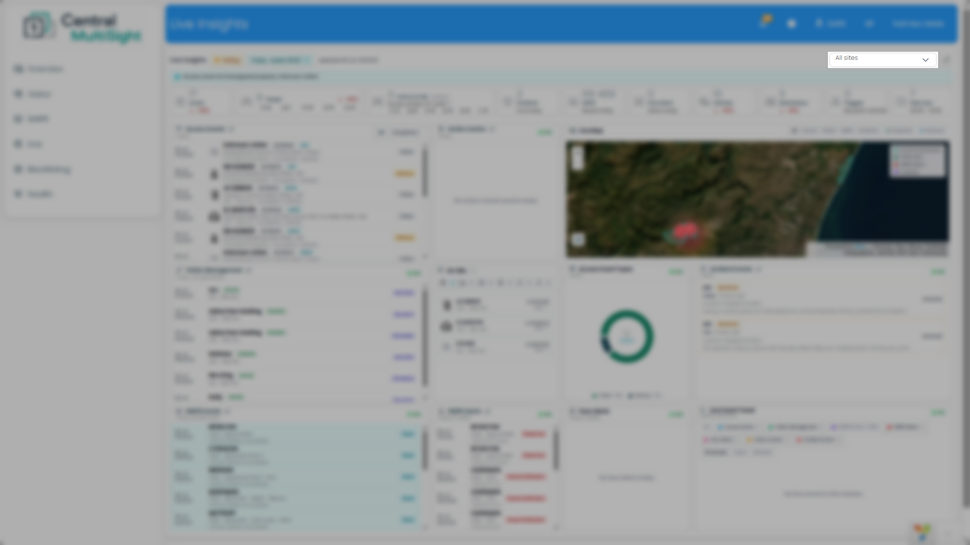
To choose what you're watching, use the site selector at the top right, labelled All sites. Leave it on All sites to monitor your entire portfolio, or open it to tick only the sites you want to keep an eye on. Every card, feed, map, and chart on the page updates to match your selection.
Because Live 1insights is built for real-time situational awareness rather than reviewing history, the Multi-Sight view is especially useful for a control room or operator covering several sites at once — one screen answers "what's happening across all my sites right now?" without switching between them.
1insights Overview — Site Selection
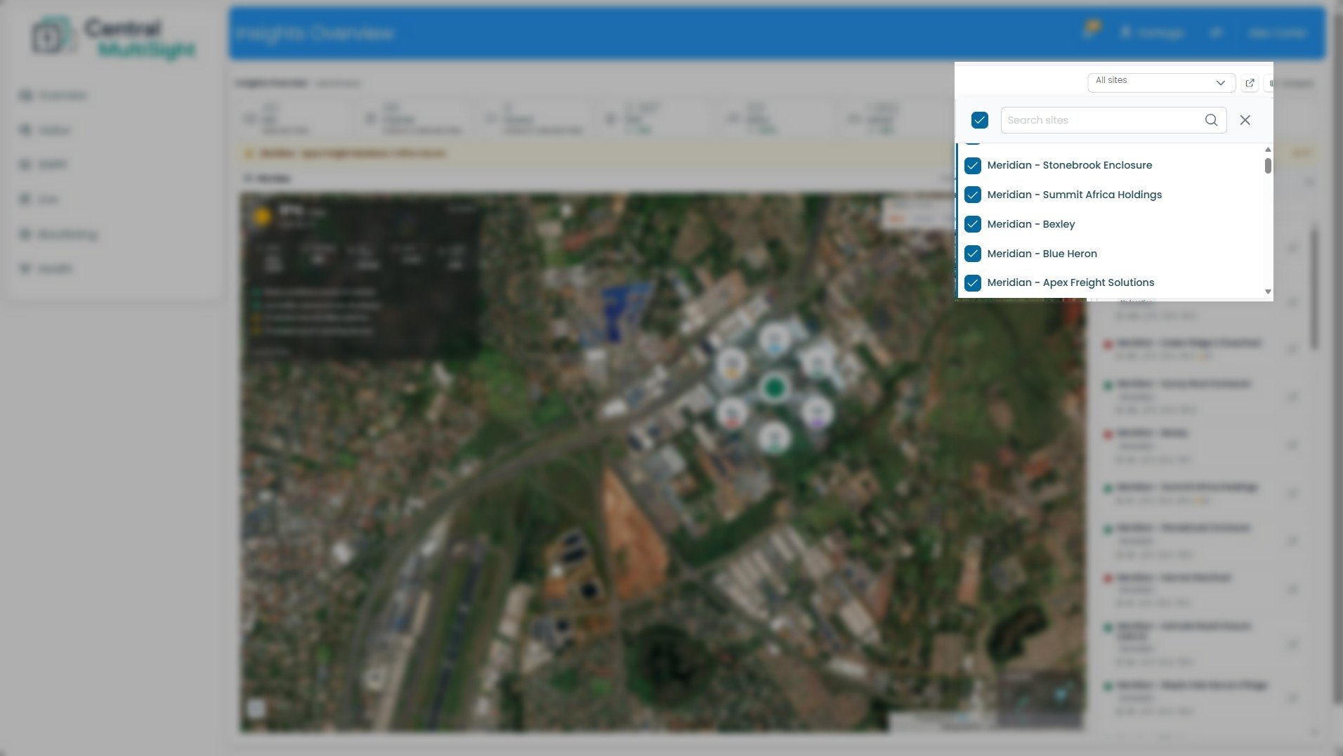
This is the control that decides which of your sites the entire dashboard reports on. Everything else — the Key Stats, the map, and the per-site list — reflects whatever you select here.
Site selector ("All sites") — The dropdown at the top right of the dashboard. Click it to open the site list shown here. The label reflects your current selection: All sites when everything is included, or a count/site name when you've narrowed it down.
Select-all checkbox — The ticked box at the top left of the panel. Use it to select or clear every site at once, rather than ticking them individually.
Search sites — Type here to filter the list by name — useful when you manage a long list of sites and want to jump straight to one.
Site checklist — Each site in your portfolio with a checkbox. Tick the sites you want included and untick the ones you don't; the dashboard updates to match. (In this view all sites are ticked, matching the "All sites" state.)
Close (X) — Closes the selector and returns you to the dashboard with your selection applied.
How to read it: A ticked box means that site's data is included in everything on the dashboard. "All sites" in the selector label confirms your whole portfolio is in view.
What to do with it: Start with All sites for a portfolio-wide view, then narrow down when you need to focus — for example, tick only the sites in one region, or a single site you're investigating, so the stats and map show just that group. Use Search sites to find a specific site quickly instead of scrolling.
1insights Overview — Site Metrics
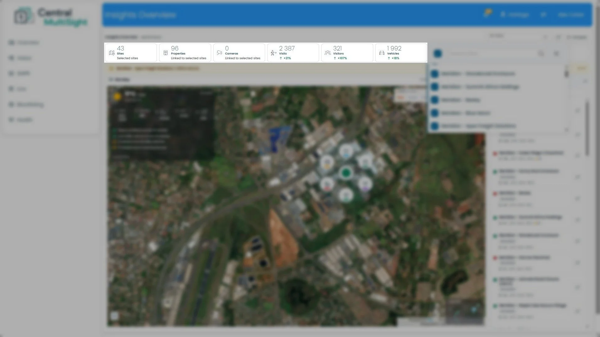
This row sits directly below the header and summarises activity across every site you currently have selected. It's the multi-site equivalent of the single-site Key Stats bar — the difference is that these totals roll up all selected sites into one figure, rather than reporting on a single estate. Change your selection in the site selector (Section 2) and these numbers update to match.
How to read it: The first three cards (Sites, Properties, Cameras) describe the scope of what you're looking at — how many sites, properties, and cameras are included. The last three (Visits, Visitors, Vehicles) describe the activity within that scope for the selected time range. A green ↑ means the figure has grown since the last comparable period; a red ↓ means it's dropped.
What to do with it: Read this row first, before the map or the site list. Check the Sites count matches the selection you intended — if it's lower than expected, you may have sites unticked in the selector. Then use Visits, Visitors, and Vehicles as your portfolio pulse: a large swing in any of them (like Visitors at +107% here) is worth drilling into, either by narrowing the site selection or opening the individual site from the list on the right to see which site is driving the change.
1insights Overview — Compare
Where the Key Stats row rolls all your sites into single totals, Compare does the opposite: it ranks your selected sites against each other on one metric at a time, so you can see which sites are busiest, quietest, or worth a closer look.
Compare button — Found at the top right of the dashboard, next to the site selector. Clicking it opens the Quick Comparison panel shown here.
Quick Comparison panel — The comparison view itself. The subheading confirms what you're comparing and over what scope — here, Last 24 hours · 43 estates — which matches your current time range and site selection.
Metric tabs — Choose what to rank the sites by: Visitors, Vehicles, Properties, ANPR Events, Alerts, Visit Events, or Visitor Pins. The selected tab (here, Visit Events) is highlighted, and the ranked list updates to match.
Ranked site list — Every selected site, ordered from highest to lowest on the chosen metric. Each row shows the site's rank, its name, a bar giving a visual sense of its share relative to the top site, and its exact figure. (In this view, the top site records 817 visit events, down to lower-ranked sites.)
Insights — A plain-language summary of the comparison, calling out the standout differences automatically — for example, how far ahead the top site is, and how many sites recorded no activity on the selected metric.
Close (X) — Closes the panel and returns you to the dashboard.
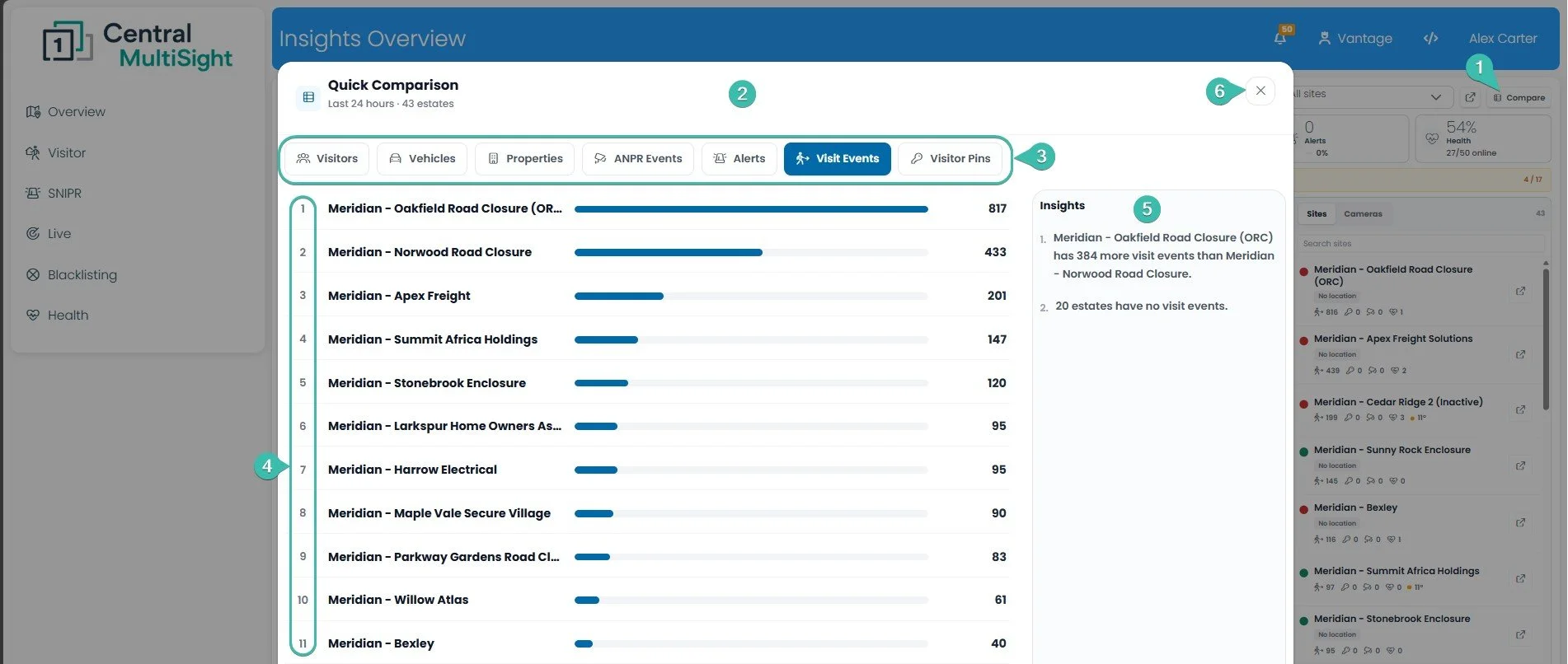
How to read it: Rank #1 is the site leading on whichever tab you've selected; the bar lengths let you gauge at a glance how much busier the top sites are than the rest. Switch tabs to re-rank the same sites by a different metric.
What to do with it: Use this to spot outliers across your portfolio fast. Switch to the Alerts or ANPR Events tab to see which sites are generating the most events needing attention, then open that site from the list to investigate. It's also useful the other way around — sites sitting at the bottom of Visit Events or with no activity at all can be worth a check to confirm that's expected and not a sign a site has gone quiet unexpectedly.